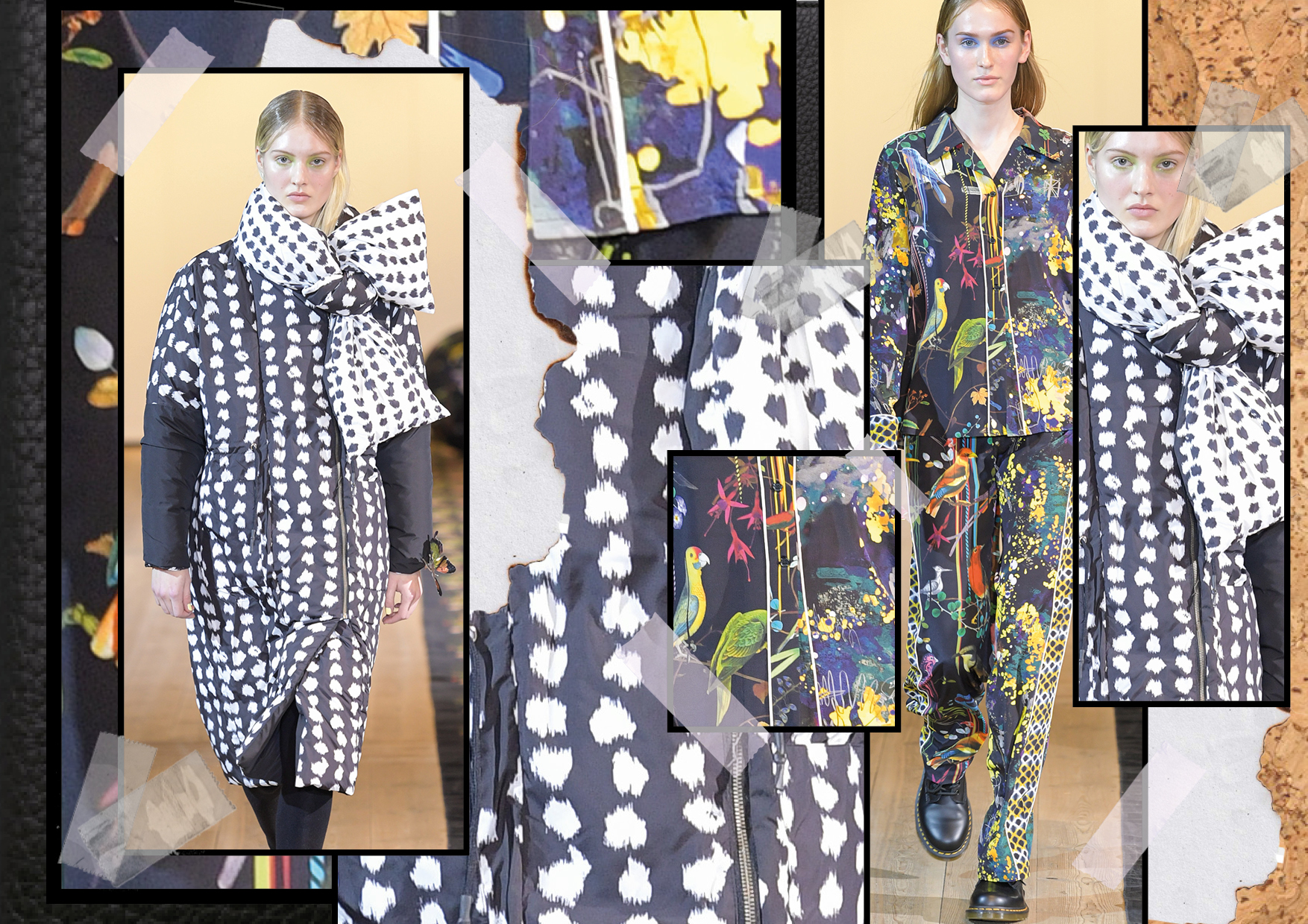
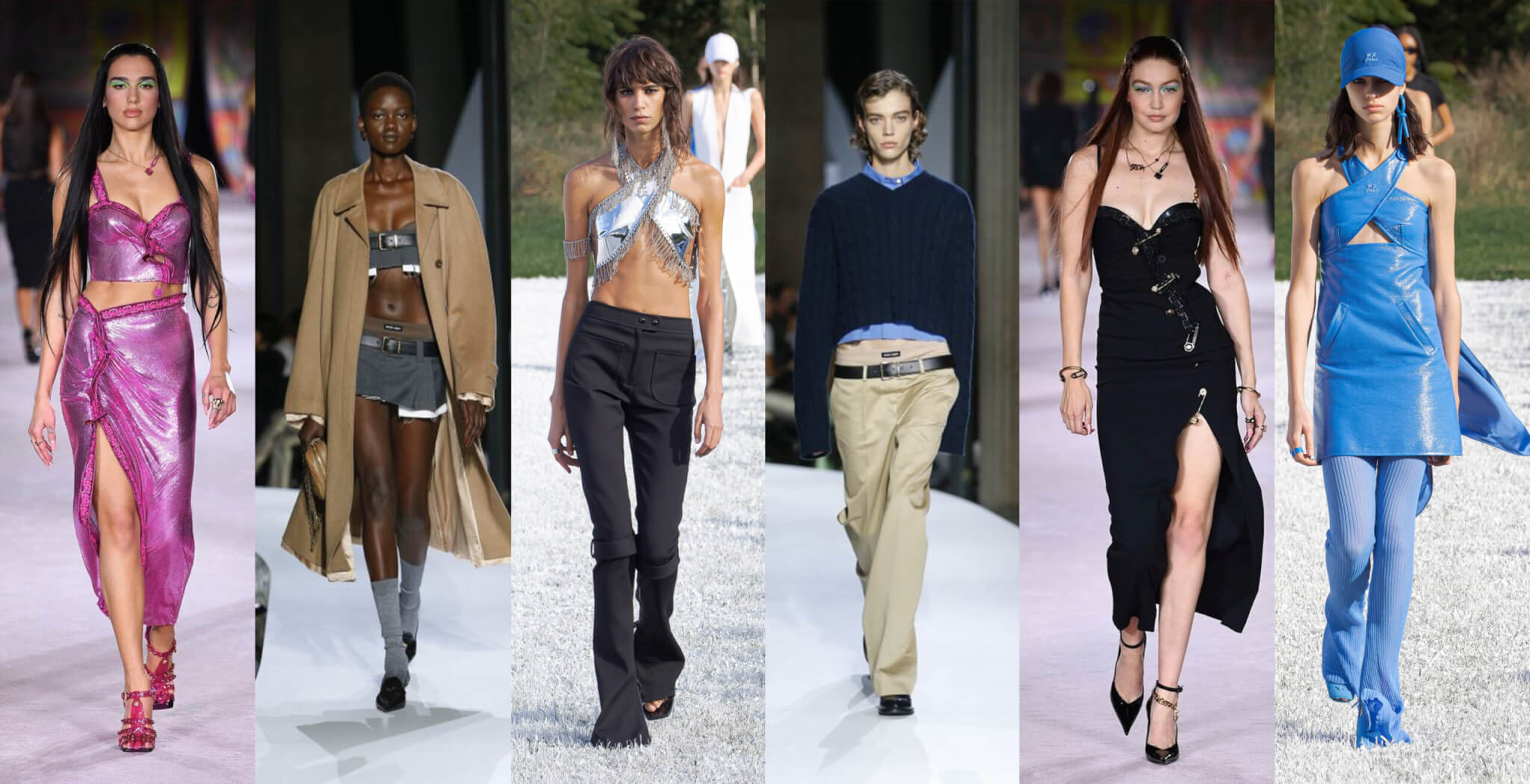
The neon color trend has taken the fashion world by storm in the past two years. You can’t escape it, whether you’re scrolling through Instagram or observing the latest street style looks and runway shows. These bold and eye-catching hues have become a staple in every fashion lover’s wardrobe.
From neon green to neon orange, the neon trend has spread like wildfire, quickly becoming a popular choice among fashion enthusiasts. It’s not hard to see why, as neon colors are the epitome of fun and fearless fashion. With neon, you can make a statement and stand out from the crowd.
Gone are the days when neon was considered too daring to wear, now it’s a must-have item in every fashionista’s closet. With neon, there are no limits to your creativity and imagination. Whether you prefer to go all out with a neon green jacket or choose a more subtle approach with neon accessories, you can easily incorporate this trend into your style.
So embrace the neon trend and make a bold statement with your fashion choices. TITLE fully embraces this trend and encourages you to have fun and let your individuality shine through.
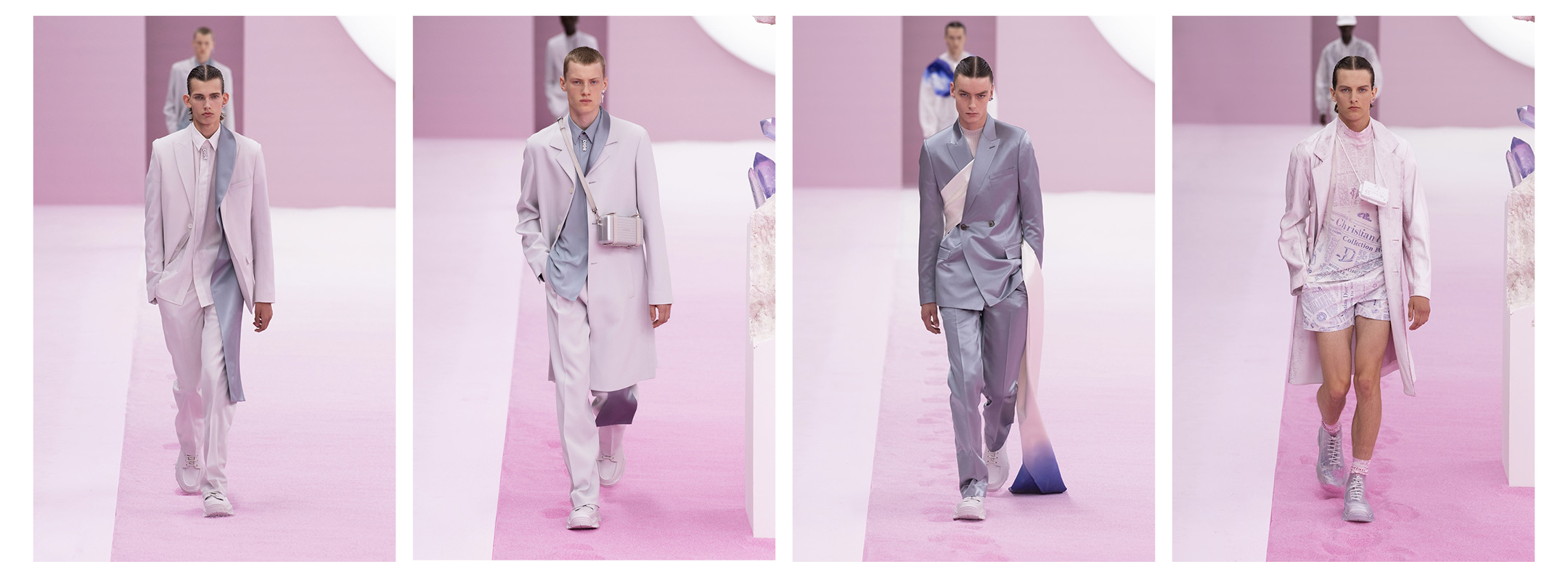
The color game in fashion is undergoing a transformation, with the Morandi color palette set to take center stage in 2020. Inspired by the works of the renowned Italian painter, Giorgio Morandi (July 20, 1890 – June 18, 1964), the Morandi colors are a harmonious blend of soft hues and muted tones. The color scheme evokes a feeling of delicate elegance, exuding a sense of luxury and sophistication.
The Morandi palette is comprised of earthy tones such as olive green, ochre, rust, and dusty pink. These colors are seen in a variety of textures and materials, from soft cottons to luxurious silks, lending a touch of richness and refinement to any outfit. The beauty of the Morandi color scheme lies in its versatility, making it easy to wear, whether dressed up for a special occasion or paired with casual, everyday items.
Incorporating Morandi colors into your wardrobe can be as simple as investing in a few key pieces, such as a flowy olive green dress or a rust-colored sweater. These pieces can be paired with neutral pieces to create a cohesive look or contrasted with bold hues for a statement-making look. With the Morandi color scheme set to make a big impact in 2020, fashionistas can look forward to incorporating these beautiful, timeless hues into their wardrobes.
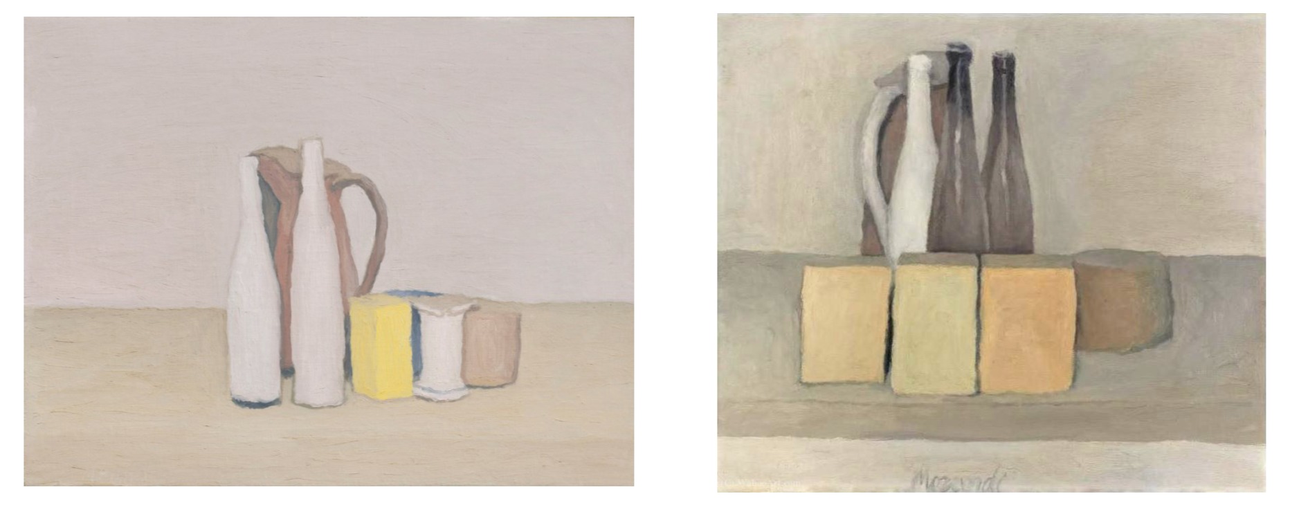
Color is a way to transfer emotions and feelings. Different from the bright and wild neon colors that are more like a punch in your face, the Morandi colors have a more calming and soothing effect, providing a slightly mysterious mood.

After the hot wave of neon reigning throughout 2018 and 2019, it seems many brands are calming down now for the Morandi mood instead. For 2020 we predict a take over of the Morandi color scheme. It’s especially interesting to see how menswear is joining this pastel route in the SS20 collections.

Some people might debate these Morandi colors or pastel colors are not “manly” enough. With your own personal styling, these colors can be romantic, sophisticated, luxurious, and even cool and edgy. We live in 2k19, color has no gender!


