Nothing Is Covered Up and Everything Is Intentional in Brutalist Interiors
Brutalism, often regarded more as an architectural haul than a fleeting design trend, has seen a resurgence in recent years. Once characterised by its raw, unrefined appearance, this austere style has made its way into interior spaces.
If last year brutalism in interior design was on the rise, this year has proven is clearly meant to stay for a good while. Beyond serving as a striking backdrop for fashion shows, art exhibitions, and performances, brutalism is now settling in our living spaces, evoking a sense of wealth, that combined with an intentional roughness, makes a bold and polarising statement of status. This contrast between elegance and roughness is becoming much looked after. According to Zillow, the US real estate platform, searches and mentions of “brutalist interior” increased by more than 452% compared to the previous year, pointing at the growing fascination with this aesthetic.
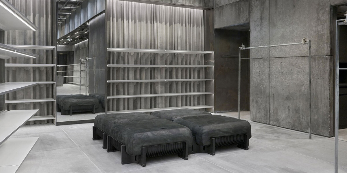
Unlike the more mainstream trends of minimalism or mid-century modern, brutalism can be challenging to apply in interiors. Its signature elements—raw concrete floors and walls, steel-framed windows, heavy bronze light fixtures, and exposed pipes—tend to work better, if not only, in large, open spaces with high ceilings. Lofts, for instance, make for a great home to brutalism. Furniture and lights play an important role in the starkness of these spaces, the absence of ornamentation, clutter, busy wallpaper, or flashy furnishings often leads to bleakness and austerity. The contrast between those elements that are absent and those that are selected purposely can introduce warmth and create a balance between the raw and the inviting.
But what makes brutalism striking is the way it acts as a blank canvas due to the lack of excessiveness, namely colours, and decoration. By creating a contrast between the austerity of the space and the objects within it, the space becomes the frame of those objects, allowing them to stand independently from their surroundings. Organic accents like large plants, wooden furnishings, natural stone, and sculptures help to soften the coldness of the environment, resulting in a warmer, more welcoming aesthetic. Sustainable materials also contribute to this balance, merging raw and refined elements.
And that is not to be confused with minimalism. While brutalism shares similarities with minimalism in that both aim to create order and tranquillity, minimalism is about decluttering and highlighting serenity, whereas brutalism adds a bolder, more imposing dimension. Where minimalism whispers, brutalism shouts. That’s a fact. Yet, the two styles aimed for clean lines and simplicity.
But how did the trend originate?
The brutalist movement emerged in the 1950s, led by renowned architect Le Corbusier, the French-Swiss architect whose ideas about living environments were informed by a utilitarian approach: a focus on functional and purposely design rather than looks. With this approach, Le Corbusier believed that standardising architecture would simplify urban planning, and this vision gained popularity especially among communist regimes, leading the style to become associated with totalitarian politics.
Today, however, the daring comeback of brutalism is shifting the narrative around it. Its architectural features and references have been reinterpreted, gravitating towards a new concept of luxury and elegance. In this process, modern brutalism, or neo-brutalism, has shed its political connotations and moved away from the idea that functionality alone could improve collective lives.
For many architects, this new wave of brutalism provides the perfect backdrop for environments where the focus is on the elements within the space, such as fashion shows or art installations and performances. The starkness of the surroundings allows the objects on display to take the stage. This is evident in the growing number of designers choosing brutalist settings for fashion shows and retail spaces. In Vogue’s annual interior design report, multiple designers highlighted the use of concrete floors and raw industrial materials in the design of their shops. As Griffin Frazen—designer of a concept store in SoHo—told Vogue, “In a space with few distractions, the customer can become aware of the subtle qualities of the clothes. The design was a process of stripping away rather than adding, to arrive at something essential and honest. Luxury can be less rather than more.”
While early brutalism prioritised function over form, often to the detriment of those living in such spaces, neo-brutalism combines functionality with a high level of aesthetic consideration and customisation. The exposed beauty of neo-brutalism is seen as the ultimate expression of luxury and sophistication, celebrating simplicity and practicality while creating dramatic, statement-making interiors.
Ultimately, brutalism’s “less is more” philosophy—or minimalism?—and its embrace of understated luxury indicates that this aesthetic, imposing as it is, is here to stay. With its silent yet striking form of elegance is made to keep captivating, and we will continue to see its appeal across different interiors, besides those associated with fashion, art, and design.


